Wednesday 28 March 2012

Week 24 Re-Draft Double Page

6. What have you learnt about technologies from the process of constructing this product?
From first using Photoshop, InDesign & blogger I’ve made major improvements from when I first started using the programme. Blogger has helped me in shaping my process in producing my product. From using blogger I have been able to keep in track with what I’m doing and how I am using it to produce my magazine, blogger has helped me maintain control by completing my blogs week to week.
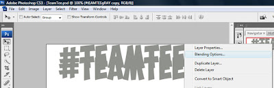
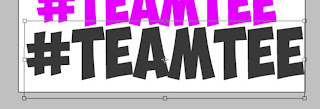
I have made improvements in using Photoshop while editing my images that I’ve been using for my media product. Photoshop gave me the opportunities to make images I had taken better than they were before like the ‘Lasso tool, contrast/brighten tool, quick selection tool and the magic wand’. By constantly using Photoshop I became familiar with the tools which helped me to produce better images when I finished editing them. 
InDesign software which has been useful to me while shaping my media product because it’s helped me produce my ‘Front cover, contents page & double page spread’. While using InDesign creating all my products from my preliminary task to my Rap magazine I have improved drastically in using the software, using the swatches and colours to help my magazine flow also using the gradient tool to use to colours on one background to make the product more professional. 

Blogger which helped me
stay in track in completing
my magazine


7. Looking back at your preliminary task, what do you feel you have learnt in the progression from it to the full product?
From my first double page spread draft I made minor changes but the changes I made benefited the final design of the product because I improved the text, colours used and also the fonts that I had changed previously. This helped my double page improve because it kept a smooth flow throughout the whole design, all the fonts were similar and all the colours chosen went together. Challenges that still lie unexplored is fully editing images changing the picture completely because if all my images on my double page spread were fully edited like how professional pictures were edited then my media product could be represented and put on the market place.

My final double page
spread.


Friday 23 March 2012

Week 23 Contents Page Re-Draft

3. What kind of media institution might distribute your media product and why?
Rap music magazine can be sold at, music venues, Rap festivals (Summer Jam), corner stops, WHSmith and supermarkets (Asda). This is because the target audience attend Rap concerts and go to supermarkets and corner stores to purchase the products. They are displayed on the middle rows of the shelves with other music magazines so they can stand out to the buyers of any type of genre they want to purchase. Rap has a variety of places where they are sold but they are less likely to be sold in high class supermarkets like ‘Waitrose’ because the target audience is middle class which may not shop there. If the product has a website then subscriptions play a big part in sales because the buyers are more likely to want subscribe to the magazine so the monthly issues are sent to their houses instead of going out and looking for the magazine to buy from a certain store. Overall Rap magazines have a variety of stores for purchase but are limited to the supermarkets they are sold in because of the social class, ‘High Class’ will not stock the magazines whereas ‘Middle class’ supermarkets will stock the magazine to be sold.


4. Who would be the audience for your media product?
The target audience of my media product is targeted mainly at a male audience ages varying from 17-28 years old. I identified this audience mainly because the products I researched aimed at a young audience and an older audience by young & old artist used in their magazines. My target audience is addressed by the model artist because he’s young and upcoming which they would be interested in and his posture in the image is direct and serious.
Artist which
has been used
to appeal to the
older generation.


The artist which are used
so they can stand out to
the younger generation.


This is one of the images
I used on my contents
page. 


5. How did you attract/address your audience?
My first contents page that I designed did not appeal to my target audience because of the colours used and how the page was laid out because the colours did not connect and the page wasn’t organised properly. My re-drafted contents page attracts my target audience more because the colour used resemblance each other because of the solid colours used and the colour scheme has been used throughout the magazine. The layout of the contents page is more organised and there is no dead space on the page all aspects of the page have been covered. The audience will see themselves in my magazine of the images used because the artist on the page will resemble the target audience.

My first draft of my
contents page.

My final draft of
the contents page.


Week 22 Front Cover Re-Draft

1. in what ways does your media product use, develop or challenge forms and conventions of real media products?
From the start of my music magazine project to guide me through creating the media product I have used the professional product ‘XXL’ (www.xxlmag.com) to help me create my front cover, contents and double page spread to make them look like a real media product which can be sold in stores. I’ve thoroughly researched the Rap genre so I can my media product stand out to my target audience, Rap magazines have showed me how to make my product appeal to buyers because of the solid colour schemes they have used throughout their magazine, also what features they regularly include. This research helped me to pick colours which go together so I could use this on my front cover and apply it to my other products. The features have carefully been chosen which were put on the front cover to attract the readers. I have challenged the generic conventions in respect of my product I researched by choosing three distinctive colours which will stand out to my target audience whereas my media product uses one solid colour throughout their whole product. Also the features and colours I’ve used have purposely been used so I can lure in my target audience to the product.

The Product I Done Research On.

My First Draft Of My Rap Magazine.


My Final Changes To My Magazine.


2. How does your media product represent a particular social group?
Before the re-draft of my front cover all the features on the cover where surrounded by male figures deliberately expressing that the target audience is predominantly men but in my re-draft I have taken a feature out and purposely added a feature that is based on a ‘Woman’ Rap artist to show that my magazine isn’t only representing men mostly like real media product which deeply focus on male artist. The main artist of the magazine expresses what time of audience the magazine is trying to attract. A young male audience from the ages of 17-28 years old, also my media product isn’t representing a particular ethnicity but isn’t representing a group of people who are particularly interested in listening to Rap music.
Where I added the female artist on
the front cover.


The artist that appeal to the target audience.


Thursday 15 March 2012

Week 20

1. In what ways does your media product use, develop or challenge forms and conventions of real media products?
My media product develops some of the forms and conventions of a real media product because of the Rap magazine I researched which was ‘XXL’ I used that as a template to develop my own double page media product. The layout of the XXL magazine helped me design my own product with how to place the image and layout the text. The distinctive layout of my content is how I’ve place the two images on my double page spread this challenges the forms and conventions of a real media Rap magazine because they normally use one image that takes up the whole page whereas I’ve used two images. One image is above the text and the other image is on the next page with text over lapping the image.

This is my completed double page 
spread that I have designed. 


This is the
double page spread I used
to help me design own media product.


6. What have you learnt about technologies from the process of constructing this product?
In constructing this product Photoshop was only useful for me to use the Brighten/Contrast tool which made the main image on the double page spread to make the image lighter. Hardware has also helped me create this double page spread because I’ve used my flash drive to transfer images I’ve took from my laptop to the school system and also my interview I done for the double page which I started at home I could use my flash drive to bring into school and finish editing. InDesign gave me the opportunity to construct a good draft product because its helped me get familiar with the tools like swatches and strokes to improve the colours I chose for the background and banner titles. Which has helped me find a colour which will help me draw in the attention of my male audience becuase colours I have chosen are solid which have a connotation of being masculine.  


7. Looking back at your preliminary task, what do you feel you have learnt in the progression from it to the full product?
Now my double page spread has been completed I can see a huge improvement from my preliminary task because the colour scheme I have chosen is consistent from the front page to the contents to the double page spread targeting my male audience. Also organising all the text and images is an improvement because the double page spread looks more sophisticated and looks like a real media product which can be sold in stores. 

Tuesday 13 March 2012

Week 19

1. In what ways does your media product use, develop or challenge forms and conventions of real media products?
I used ‘XXL’ magazine as my Rap magazine research and I found a double page spread that I liked but instead of developing the forms of the conventions of a real media products I challenged the forms & conventions to start creating my double page spread. The distinctive content of my double page genre is shown through the photographs of the leading artist and the text I will put in. Unlike the media product I found I will use two images on my double page spread to attract my target audience. By the formal language I’m going to use on my double page and information you’ll know my magazine is aimed at an older sophisticated male audience.

This is the double page spread I used as research to start creating my own media product.


6. What have you learnt about technologies from the process of constructing this product?
Using Photoshop on the double page spread has been a limitation because the images I’m going to include on my double page spread do not need any editing because I felt the background of the images are good enough. But the Brighten/Contrast tool will be used on one of the images to make the picture lighter. InDesign has been an opportunity to use on this double page draft because I can fiddle around with the swatches and strokes tool for the texts and images so when I come to create my final design I will have the knowledge of what tools to use and how to lay out the final double page spread.


7. Looking back at your preliminary task, what do you feel you have learnt in the progression from it to the full product?
Looking back at my preliminary task and looking at how I’m creating my double page spread I can see a huge improvement because when you look at my double page spread you will know the target audience which is males aged between 18-35 years old because of the ‘Bold’ text. Since using Photoshop for my images on my preliminary task I’ve improved in editing images and how I want the outcome to be. Using the ‘Align’ tool on InDesign has helped me improve to place my text whereas on my preliminary task I had texted scattered all over the page. Also on Photoshop the ‘Quick Selection’ tool has helped me improve my work because the edges are smoother. Also since my preliminary task my media product designs have improved so they represent a real media product before my music magazine my preliminary task looked like a poster whereas this media product is going to have the conventions of a real product with improved features.
This youtube clip helped me when changing the aspects of images.

Monday 12 March 2012

Week 18

1. In what ways are you designing your media product to use, develop or challenge forms and conventions of real media products?
I am designing my double page spread to develop the forms and conventions of a real media product because I was looking at examples of research I done on real media products like ‘XXL, Vibe & The Source’ and all of these Rap magazines have the same forms and conventions of how the layout their double page spread. So with my media product I wanted to develop the forms to make it stand out and familiar with my target audience. I made use of the research I found by developing the layout of the XXL magazine double page spread but I made one change to it by adding a second picture whereas the real media product only used one large image by me deciding to add an extra picture more space is taken up for writing the article but the pictures show the target audience who is the main topic of the double page spread. Also the way I have set out the text for the double page spread challenges but also develops real media products because normally all their text is just on one page all together whereas my text will be spread out between both pages with catchy fonts to grab the readers eye.


2. How are you designing your media product to represent particular social groups?
I’m designing my media product to represent more of a male social class because that’s my main target audience. The dark colours I’ve used show this is mainly at men because women like more bright colours and the dark colours like black & red will attract the male audience and colours like black, blue & red which I will be using are more masculine colours. Butler J’s theory says to be masculine/feminine is sociological but I’m going against this theory as I believe only a male target audience will attracted to my media product. Also my artist will represent my social group because the photographs that are going to be use on the double page spread wouldn’t be used on a jazz magazine because you would see an artist with a trumpet or something but my artist for my media product would hold a microphone.

5. How are you attracting/addressing your audience?
The audience will be able to reflect on my media product because the way I’ve laid out my double page spread is calm and organised. It’s not rushed or messy the readers will be able to find everything without any fuss or searching so my media product will attract organised males who like to read about Rap music. The colours I am going to use on my double page spread are bold and solid so this will stand out to the reader because they are solid colours which make the text stand out more to the reader. Also the heading of the double page spread is bold so as soon as the audience see this they’ll know what it’s about and who it is about.

Friday 9 March 2012

Week 16

1. In what ways does your media product use, develop or challenge forms and conventions of real media products?
While creating the media product I created a brand identity for my magazine so my media product could stand out to the target audience when they are looking for a Rap magazine to buy. The unique features of the contents page are the ‘colours, features, fonts, ect’ have been used to stand out to the readers. Because fonts I have are used are bold so the text is bold and the reader can see this and also colours I have chosen are not normally used in real media products solid colours are used whereas I’m using bright colours to attach my audience. I developed forms from real media products of how they set out their pages and laid it out in my own way of where the text went and how the images were laid out.


6. What have you learnt about technologies from the process of constructing this product?
During the creation of my contents page I didn’t have to use Photoshop much as all the images I took I didn’t need to change the background colour as I felt they were good enough. But on one image I used Photoshop by using the ‘Lasso tool, Crop tool & the brightness/contrast tool’. Since lasting using the Lasso tool on my other images for covers and preliminary tasks I have improved by using the feather tool to make the edges smooth. Also by setting the contrast of the photograph helped the image to look more professional like real media products. Using InDesign I have improved because all my text and images were together and there was empty spaces everywhere but on my music contents page everything is organised and in place.


7. Looking back at your preliminary task, what do you feel you have learnt in the progression from it to the full product?
Looking back at my preliminary task and looking at my contents page I can see an improvement because my first content page on the preliminary task was basic everything was clamped together there was too many empty spaces on the page whereas my music contents page everything is organised and I didn’t rush it like I rushed my preliminary task. I’ve also learnt since creating my preliminary task what fonts to pick and what colour schemes to use so you can attach your target audience. Also I’ve learnt you need to fill in the dead spaces on your pages so there are no empty spaces and don’t give too much information but don’t give limited information.

Tuesday 6 March 2012

Creation of image for Contents Page


First I opened a new page on Photoshop chose the settting 'A4' and international paper to create the following image.


Before I started designing the image I had to design which font I would be best to use so I went through the list of fonts on Photoshop and didn't find anything I like so I went to 'www.1001freefonts.com' and downloaded 'Obelix Pro' then chose the size of the text.

After I chose the text and font size then i had to chose the colour I wanted to use for the text of the photograph.


After I chose the font, size & colour. I then proceeded to the write the text *#TeamTee*. And placed the text in the middle of the paper.


After I wrote the text in I then right clicked the photograph and clicked on 'Duplicate Layer' so I could add the text again just underneath the orignal text.


As you can see the text has been duplicated now that has been done I'm going to chose another colour for the second duplicated text that I put in.


The layer of the duplicated text I right clicked on it so I can chose the 'Blend options' to change the colour of the text.


After I clicked Blend Options this window opened and once it opened I went to the box 'Colour Overlay' then I picked the colour 'Red' to become the new colour of the duplicated text I created.


As all the previous steps I done the same thing to have the outcome for this photograph above of the text '#TeamTee' repeating in many different colours.


The box that is highlighted I'm going to use the stroke tool so I can create a outline for this text only.

I went to the Blending Options again so I could use the stroke tool to outline the last piece of text in the image.

I clicked on the 'Stroke' box so I could apply the effect to outline the text so it could stand out as it is at the bottom of the image.

Then this window appeared where I can chose the colour I want to use for the outline so I wiggled around the mouse until I found a colour I felt was suitable to be the outline then I clicked 'Ok' to confirm it.

To complete the image at the top of the toolbar I clicked on 'Brushes' so I could add some splashes to the background of the image and the I chose the colours 'Red & Grey' to be used as the background splashes.

This is the finished image I created on photoshop to use on my Rap magazine contents page.